Letter Case Conversions

Sometimes you need to fix text with the wrong letter case. Maybe you copied text that’s all uppercase letters, but you need lowercase letters (eg: change “EXAMPLE” to “example”). Nisus Writer has two ways to help you convert such text.

Character Conversions
Most often you will want to do a one-shot conversion of your text using the menu Edit > Transform Text. For example, using the To Lowercase command. That will convert the underlying characters to their lowercase counterparts (eg: “A” to “a”) at the single moment in time when you activate the command.

Text Display Conversions
Instead of converting the underlying letters, Nisus Writer can also display a converted version of your text. In this way your text remains unchanged; it’s just the display that changes on screen (and in PDFs and printouts).

You enforce such display conversions using the menu Format > Letter Case. Commands on that menu operate like other kinds of text formatting (eg: bold font) in that they are continual. If you retype the text to which that formatting is applied, what you see immediately undergoes the same transformation. The newly typed text will be converted for display automatically, without reapplying the command.

Typically these kinds of display conversions are employed via styles. It’s nice when (for example) your headings have consistent uppercasing, no matter what’s been typed in your document. This also makes it easy to change your mind– just edit your style and all your text will be updated as needed automatically.

Small Capitals
One very popular kind of text display conversion is small caps. That’s where all letters in your text are displayed using capitals, but lowercase letters appear smaller:

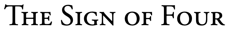
Nisus Writer supports small caps for all text and fonts. Proper typographic small caps will be used if a font provides them. If a font lacks typographic small caps Nisus Writer will synthesize their display by shrinking the font size like so:

The above screenshot shows a “faux” small cap for the Zapfino font. It’s somewhat surprising that Zapfino lacks typographic small caps considering all its other font features like crazy ligatures.

You might wonder, what are proper typographic small caps? Aren’t all small caps just shorter versions of uppercase letters? Typographic small caps may have been customized by the font designer, usually so the small caps are more distinctive. Here’s a screenshot showing Adobe Garamond Pro:

The small caps F (rightmost blue) may look like it’s simply a smaller version of the capital F (leftmost yellow), but it’s not. The middle image above shows a shrunken capital F overlaid on top of the small caps F. You can see the small caps F is actually quite a bit heavier.

Hopefully this shows you some of the many ways Nisus Writer can help you process your text and the intricacies involved. If you have any questions please let us know by commenting below, joining our forum discussion, or contacting us directly.

TidBITS at 30

I guess I’m an old timer because as long as I’ve been a Mac user (almost 30 years now) I’ve known about TidBITS. However, there is plenty I did not know, and Adam Engst’s appearance on The Talk Show podcast fills in quite a few of those gaps.

Congratulations to Adam and Tonya Engst for 30 years of TidBITS. 

Ten Lorem Ipsum Generators To Make Your Placeholder Text Sizzle!

Lorem ipsum is the standard text placeholder that typesetters, web designers, and other weirdos use to test text layout. It dates from the 1500s, when an unknown typesetter jumbled pieces of Cicero’s De Finibus Bonorum et Malorum (“On the Extremes of Good and Evil”) to use in a type specimen book. Things didn’t work out so well for Cicero, but lorem ipsum has survived for several centuries. 

Lorem ipsum is fine for general use. If you are a Nisus Writer Pro user we offer a macro that will let you produce all the scrambled Latin your heart desires. However, if you’d like to add some zip to your ipsum, there are several variations to spice things up a bit. 

Here are some of my favorites:

Bacon Ipsum

Are you kidding? This one is great. All the bacony goodness you can stand. Here is a sample: “Bacon ipsum dolor amet drumstick filet mignon jowl, shoulder corned beef brisket ground round beef ham ball tip andouille flank tenderloin.

Veggie Ipsum

Since I chose one with meat it’s only fair I chose one for vegetarians: “Veggies es bonus vobis, proinde vos postulo essum magis kohlrabi welsh onion daikon amaranth tatsoi tomatillo melon azuki bean garlic.

Pirate Ipsum

Yar! Do I really have to explain this? “Prow scuttle parrel provost Sail ho shrouds spirits boom mizzenmast yardarm.

Hipsum

Hipsters. They really do exist. They even have their own ipsum generator: “Etsy truffaut yr sartorial, ramps cray pour-over farm-to-table cred authentic meh retro salvia put a bird on it artisan. 

Office Ipsum

Pretty straightforward here. Everything you have ever heard in every meeting ever. Try to stay awake while reading this: “Cloud strategy market-facing message the initiative or player-coach nor can you champion this that jerk from finance really threw me under the bus.

Cat Ipsum

If you have a cat, you know this is what they are thinking when you think they are being adorable: “Lay on arms while you’re using the keyboard spread kitty litter all over house cats woo paw at your fat belly hunt by meowing loudly at 5am next to human slave food dispenser.

Legal Ipsum

Legal gibberish, just like the End User Agreements we never read: “To make sure the software is provided in the code itself as the Maintenance section of LPPL to apply to the terms and conditions of Section 2.1 with respect to a third party.

Lit Ipsum

This is another favorite. Choose between seven different classic literature passages: “They now walked on in silence, each of them deep in thought. Elizabeth was not comfortable; that was impossible; but she was flattered and pleased. His wish of introducing his sister to her was a compliment of the highest kind.

Monocale Ipsum

Monocale ipsum is… well, just look at it: “Monocle ipsum dolor sit amet winkreative sleepy exquisite international Fast Lane Melbourne first-class quality of life cosy.

Cheese Ipsum

Now we are talking. All the cheese with none of the crackers: “Cream cheese stilton macaroni cheese. Cheesecake pecorino taleggio cauliflower cheese fondue cauliflower cheese pecorino croque monsieur.

Bonus ipsum: Chuck Norris Ipsum

Yet another favorite of mine. Yes, it’s silly, but it’s Chuck Norris! “Chuck Norris doesn’t read books. He stares them down until he gets the information he wants. There is no theory of evolution. Just a list of creatures Chuck Norris has allowed to live. The quickest way to a man’s heart is with Chuck Norris’ fist.

This is just a small sample of the many interesting takes on lorem ipsum. If you have any favorites please leave a comment below. We’d love to hear from you.  

Trump and Two Spaces

I recently came across a copy of the COVID-19 economic relief explanation letter being sent out by the White House here in the United States:

economic relief explanation letter

What was interesting to me was not the contents of this letter, but rather the spacing after each period.

You can see that there are two spaces after nearly every period. That standard is passé now (so much so that Microsoft Word is now flagging two spaces after a period as an error). The use of two spaces was not surprising. What is unexpected is that sentences starting with the letter “A” don’t appear to be preceded by two spaces:

In the above comparison you’ll see that the bottom two sentences have less space after the period, before the letter A. It looks like a single space to me. Only sentences beginning with the letter A have this reduced spacing.

These spacing differences could be explained by kerning if they occurred within a word. Fonts usually customize the space between adjacent printable characters based on the actual letter geometry, so everything looks nice and neat. But I don’t think kerning can account for the big differences seen in this letter, especially considering the spacing variations occur for whitespace, not printable characters.

Ultimately this is pretty strange. I’ve never seen a single document intentionally use both single and double spaces after a period.