
I recently came across a copy of the COVID-19 economic relief explanation letter being sent out by the White House here in the United States:
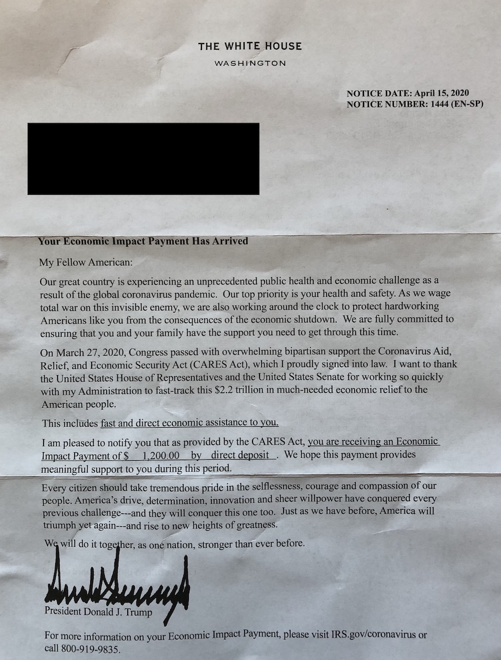
What was interesting to me was not the contents of this letter, but rather the spacing after each period.
You can see that there are two spaces after nearly every period. That standard is passé now (so much so that Microsoft Word is now flagging two spaces after a period as an error). The use of two spaces was not surprising. What is unexpected is that sentences starting with the letter “A” don’t appear to be preceded by two spaces:
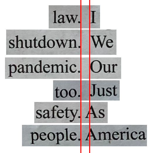
In the above comparison you’ll see that the bottom two sentences have less space after the period, before the letter A. It looks like a single space to me. Only sentences beginning with the letter A have this reduced spacing.
These spacing differences could be explained by kerning if they occurred within a word. Fonts usually customize the space between adjacent printable characters based on the actual letter geometry, so everything looks nice and neat. But I don’t think kerning can account for the big differences seen in this letter, especially considering the spacing variations occur for whitespace, not printable characters.
Ultimately this is pretty strange. I’ve never seen a single document intentionally use both single and double spaces after a period.
Pingback: Michael Tsai - Blog - Microsoft Word Now Flags Double Spaces As Errors
trump said “it’s twice as good and because it’s worth it”. Trump and Chuck Norris, same fight :-)
All that is missing is the great philosopher, Jean-Claude Van Damme, to get everyone to agree. Nice