
There’s a lot of complexity that goes into the display of text. Text features like ligatures, small caps, and font substitution surface some of the complexity, even for languages like English whose Latin letters have been part of technology since the very beginning (ASCII encoding was standardized in the 1960’s). For languages whose letters and typography aren’t as simple as English things are much harder.
This article on digitizing the Urdu language explains the bigger challenges. It’s fascinating to read about:
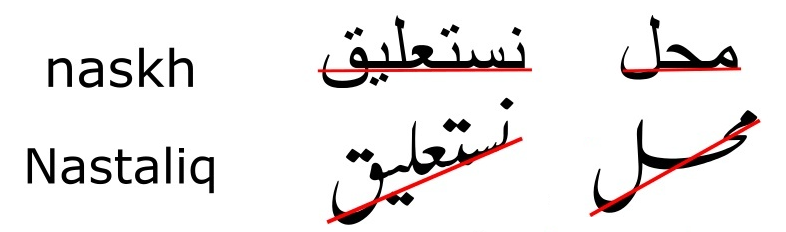
The traditional nastaliq script also requires that letters change their height based on their position within a word. There’s a slant to everything, so the text looks like the “wings of flying geese”. You can see the slant in this sample image of nastaliq:
It’s wonderfully artistic, but a difficult writing system for fonts and technology to properly handle.